
Happy New Year!
As promised, I'm starting the year off with a post about kitchen colors. Much of what I seemed to work on this past year involved helping clients select colors and materials for kitchen remodels. We're not just talking about repainting and adding a few new appliances. All of the kitchens I've worked on this last year were ripped down to the studs and redesigned to fit the homeowners tastes and provide better space utilization. Exciting stuff!
One of my favorite projects involved a bay side condo. The owner was fortunate enough to own two lovely condos in this condo community and was able to live in one with his family while working on remodeling the other unit.

This is what we started with!
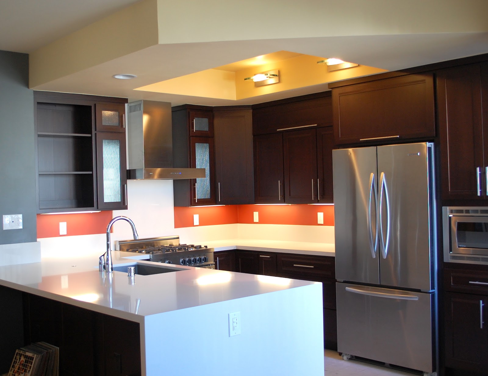
The lovely Caesarstone counter tops were a high contrast from the deep, rich cabinets. The floorplan is open to the living room so the entire great room has to be considered in this situation so colors flow.

My client had some wonderful inspiration pieces we initially worked with. The first one was a wine label on a favorite bottle of wine from Napa Valley. After much consideration, my client agreed that working around the purple/silver combination was not going to easily allow for the other colors he wanted to bring in.
Another inspiration piece he brought out was a colorful leather purse he had purchased for his wife in Italy. The lovely deep burnt orange was the direction I was hoping we would go in. He also had a business card from a taco bar in San Diego which had a similar deep orange/red he liked as well as a deep grey. A small sample of tile he had picked up recently contained more colors he liked. Although we considered the tile for the column on the left side of the kitchen, it was ruled out budget wise.
Colors used were Concord Ivory, Amherst Gray, Cornsilk and Fireball Orange.
Inspiration pieces:


Fast forward and I returned to see the result. My favorite part! Although my clients are still working on the rest of the condo and have not moved in yet, they are thrilled with the outcome. They love to cook and entertain so this modern kitchen compliments this perfectly!

A huge thanks to them for letting me help them realize their vision!

3 comments:
looks great, Marie!!
Beautiful kitchen, and that orange is just perfect!
Your kitchen is gorgeous! I'm loving the dark wood cabinets and cove lighting. But most divine of all is the divine countertop. Carpet Cleaning Solutions
Post a Comment