header photo

Thursday, December 31, 2009

Season of Silver


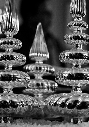
The holidays sneak up on me like a familiar, nicely dressed lady saying, "What, are you really surprised I came back again so quickly?" Having just ushered her out the door last January, here she is again demanding me to drop everything and get festive. Although I've banned all white mini lights in favor of multi-colored LED lights on the tree and throughout the house, I love the look of silver for the holidays. Whether it be silver tinsel trees, mercury glass ornaments or silver glass glittered trees, I love the play of holiday colors and light off silver. Happy holidays to all my clients, friends, family and my wonderful colleagues in the architectural color field. It's a dream come true for me to do work that feels more like play! May 2010 bring you and yours many blessings.


Monday, November 30, 2009

The Saga of a Basement


1956 basement fun
Originally uploaded by 50s Pam
Basements have always fascinated me. On summer vacations up to Eastern Oregon, I was very envious of my Oregonian friends and their cool basements. They were the ultimate hang-out places for us teens and a great barrier from the parents upstairs. One friend's basement had a pinball machine and access to HBO with 3 sofas to lounge on. Another had the best in 1980's Atari videogames and the latest New Wave records on their stereo system. Back home in Central California, no one had basements. Just row after row of 1960's and 70's one story tract homes. Fast forward to the year 2000. In the midst of relocating to the Oakland Hills after 12 years in San Jose, I stumble on the most exciting aspect of all in the unique open homes we tour. Basements! So many homes here seem to have them ! The real estate agents love to call them Rumpus Rooms and I keep imagining some swinging 1950's version of a basement. We soon buy our dream bungalow right next to Montclair Village; A 1949 4 bedroom/3 bath cottage built by the architect/former owner of the home. We are only the second owners and soon I have visions for the small half basement attached to the downstairs bedroom and bath. It was once the owner's wood working shop and is very rough. Luckily, there are no flooding or leaking issues and I start to imagine the possibilities. Baby #2 arrives shortly after we move in and slowly over the next 9 years, the basement haphazardly evolves. Cabinets are painted and then pulled out in later years, doors removed, but lack of vision and time keeps our little basement looking ignored. Prior to my career in color, I made the error many people make with basements by assuming that very light color is the way to lighten and brighten such a room. Wrong! We painted a warmer white over the rough wood and cement walls and lived with it for many years. The poor basement was hardly every used for anything but storage. It felt cold and unfriendly.


Now faced with 2 rapidly growing boys and their entourage of buddies, the house is feeling smaller than ever upstairs. We decided last year to recapture this space and use it as a media room. Time for the white to go! In it's place I decided on a delicious caramel(Benjamin Moore's Autumn Bronze 2162-10) while my husband made the bold suggestion of a deep purple (Benjamin Moore-Tulsa Twilight 2070-10) on the exposed ceiling to hide all the functioning pipe and ductwork while adding a luminous, edgy element we didn't feel a deep neutral like black could bring in. The basement instantly felt warm and inviting! My worries that the deep color would absorb too much light were unfounded. The basement budget is tight and work progresses slowly. We've added an IKEA full wall system while still having storage behind the system. Felt Flor tiles from CB2 in gray made a nice, easy addition over the cement floor and a projection system makes movies and videogames come alive. Next stop is new lighting, seating and a kitchenette to replace the old utility sink that we ripped out. Stay tuned, it's still a diamond in the rough!


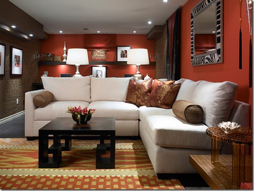
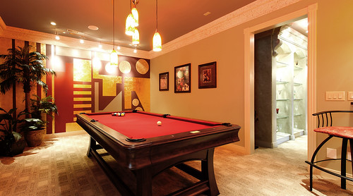
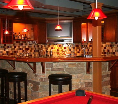
More wonderful basement ideas I love!


Candace Olsen
Images:Flickr
Yes! A non-white ceiling!

http://www.flickr.com/photos/kairosphoto/3533739829/


Burton Walsh Interiors

Saturday, October 31, 2009

The Happiness of Orange


Halloween is one of my favorite holidays and the gateway into a festive season of parties and celebrations. The appearance of vibrant oranges in the changing leaves, Halloween decorations and pumpkins are a welcome change in palettes after the softer hues of summer have come and gone. Orange has many positive associations and really no negative cultural or emotional associations. Orange is often seen as jovial, energetic, lively and social. In design, as with red, a little can go a long way with most people! However, when subdued and darkened, deep oranges are a wonderful consideration for interior and exterior design. Deeper oranges can add a natural, soothing feel to a room while brighter orange accents can bring a needed pop of warmth. If you find yourself continually headed into your safe zone of tried and true colors, consider exploring orange......and have a Happy Halloween!


Wednesday, September 30, 2009

Sample Sizes Help Prevent Costly Mistakes


Picking out new colors for a room can be a joyful, creative process for some and a stressful chore for others. You've probably looked at tons of tiny paint chips in the store and taken a few home. Have you discovered they look completely different at home?! Perhaps you've also noticed how different they look when applied to the whole room or exterior. Yikes! What are paint companies doing to help you avoid surprises and help with this process? Quite a bit! They've listened to consumers and are quickly evolving their products to help customers make the crucial next jump before the costly purchase of a few gallons of paint.

Most major paint companies have offered test sizes of paint for some time. The drawback has been that they only offered maybe 100 or so ready mixed samples of their complete line. If your paint color was not one of the sample colors, you'd have to move up to the brand's smallest size, usually a quart. At about $15 a pop, that can add up when you've got a few colors to test!

Benjamin Moore is the latest company to recently ditch their limited, ready made color samples and now custom mix ANY of their over 3,000 colors in a larger, pint sized sample for around $6. Sherwin Williams offers Color To Go samples for $5 in a two pint size. What a bargain! Lowe's Valspar brand also offers 8 ouch samples in any of their colors which will cover up to a 4 by 4 foot area. Even budget paint companies like Dutch Boy have gotten in on the trend with custom mix samples. Not quite there yet is fan favorite, Pratt and Lambert. They offer cute 2 ounce color pots in 140 of their 1,000 plus colors for about $4. Though frankly, I'd pick up two samples or go ahead and splurge on a quart to ensure I had enough paint for two coats on a large sample board.

Most sample sheens tend to be in a paint brand's version of Eggshell or other low sheen finish. Keep in mind that the higher the sheen you will actually use, the darker the color will appear. This visual trick usually evens out as most colors will appear lighter once they are applied to an entire room or wall. Higher sheens also bump up paints costs a bit.

Monday, August 31, 2009

Front Door Colors


I've always been fascinated by front door colors. They can add balance to the color design of a home, throw it off kilter, or simply sit there doing nothing. It's a treat to see doors that look welcoming, intriguing, classy, playful or simply fit the personality of the homeowners.

I love the historical and cultural background that door colors have. In Feng Shui, door colors have great significance because the door symbolizes the flow of good energy into the home or "mouth of Chi". Although red has traditionally been the color of a Feng Shui door, many practitioners believe the color is determined by which direction your door faces. South doors are often acceptable in yellows, oranges, reds, purlples, pinks, greens or browns. Irish lore suggests that wives often painted the color of their front doors a bright color to help their men find the right door after a night at the local pub! Many early American doors and shutters on homes in the Civil War era were painted with the well known Charleston green color of black-green when the Union donated huge amounts of black paint to the rebuilding effort in the South. The Southerners, ever fond of color, added green to the black.

Have you looked at your front door lately? Look at it from the perspective of someone coming to your home. What is the color saying about you and your home? Is it doing you and your home justice? Most American door colors are white, red, black or stained wood. But how fun to see a deep yellow, navy blue or sage green door! The trick is whether your architecture, other exterior home colors and landscaping will embrace it. Often, neutral colored or brick homes can use a shot of fun door color. Another trick is using the opposite color family from your main home color if you want your door to stand out....such as a yellow door on a deep blue home. Not sure? Hiring a color consultant is an easy, affordable way to help you decide.



Friday, July 31, 2009

Are You Ignoring Your Hallways?

Hallways are an often overlooked part of the home which begs for color. Hallways can be a fun area to experiment with colors you might not consider in other areas of your home. Since you are just passing through this area, there is less of an issue of becoming tired of or overstimulated by an adventurous color. Consider which rooms flow to the hallway or open to it. I'd consider the flow of main rooms more so than bedrooms that may open to the hallway. With that said, have fun and play with contrasts a little! Sometimes throwing colors rules and concepts out the window and going with what looks good to your eye is the best solution.


Tuesday, June 30, 2009

Do You Dare?


Red is a color that evokes so much color and emotion. It's a color that often both scares and intrigues my clients. On the positive side, red is often associated with passion, excitement and speed. It's thought to stimulate the appetite. On the negative side, red can be viewed as aggressive, gaudy and overpowering. No wonder it's used as an attention getter in important sign age and visual cues. It's can overtake whatever else it sits with like a boisterous, attention grabbing extrovert. Red is a color to use with knowledge and care.
Personally, I love red so much that I've yet to tire of my glossy red dining room walls after 8 years. People feel drawn to red. I find guests often love to stay put in this part of my home! It took a long time to find the right Chinese lacquer red I envisioned, but it was worth it (Benjamin Moore-Heritage Red). Reds can range all the way from blue based reds (like a strawberry) to the yellow based reds (think tomato). Brownish reds, orangish reds and pinkish reds further add to the dilemma of choosing the perfect hue. Red can be terribly fatiguing on the eye so it's not a recommended visual ergonomic choice for office space or other areas where you are spending a lot of time. It can cause what's called “after images” when the eye looks away from the area of red. In the case of my dining room, the color is broken up by wood paneling, wall art and windows which somewhat dilutes the visual strain of a shiny red room. (Pictured at top) For those who don't wish to commit to an entire red room, an accent wall, red accents or a red powder room may give you the fix of red you desire.

Thursday, May 21, 2009

Color Contrast


Contrast plays an enormous role in successful color design. Many different kinds of contrasts exist. No one better identified and explained this concept better than legendary Bauhaus professor, Johannes Itten, in the early 20th century.
http://www.worqx.com/color/itten.htm
Contrast between cool/warm colors, color saturation, complementary colors, etc, are vital considerations when choosing harmonious color palates. All materials need to be considered in color selection both with interiors and exteriors. This can include roofing, trim, flooring, accessories and even landscaping.
When a color scheme seems off, it can often be explained by uneven color contrast in one of the various contrast categories.

Monday, March 2, 2009

Understanding Natural Light


I've had more than one client fall for the claims of "foolproof" color palates or fall in love with a color in a friend's home only to discover it looked dismal in their own home. The most carefully chosen color palates are sure to disappoint you if you don't view them in the room they are intended for.
In the case of my client who chose a paint company's "foolproof" color palate, the colors probably looked fabulous in the light of the store but once they were applied to her daughter's room, which only received direct light first thing in the morning, they appeared drab and depressing! Another client fell for a golden yellow that looked terrific in a friends home. When we viewed the color sample in her dining room, however, she could see that it would appear far too orange in her own home.
How wonderful if you have some rooms in your home that get an all day southern exposure of natural light. But in reality, many of us grapple with rooms that may have only some natural light in the morning or don't receive direct light until late afternoon. This must be a consideration when understanding color and how to use it in different natural light conditions. The function and visual ergonomics of a room must also be assessed in choosing appropriate colors. Natural light also changes in color throughout the day and in different geographical areas as well as in different seasons. Light appears bluer in the early morning and progresses to yellow, orangish then redish orange as the day progresses. Color in the Northern California appears grayer than the warm climates of Southern California.

Saturday, January 31, 2009

Don't Forget the 5th Wall!


One of the most overlooked areas of color for interiors is the ceiling. I encourage my clients to think of it as their 5th wall when considering colors for a room. If you are fortunate enough to have ceilings over 9ft. high, you have an infinite number of options that can be considered. For lower ceilings, the old rule of a white creating a feeling of height is being tested and challenged! A well considered deep color can add expansiveness and make the eye feel that there is more height to the room. Deeper color in a room with high ceilings can give the space a much more intimate feeling. Even a lighter tint of the wall color selected can bring a wonderful sense of cohesion to a room.

Remember, just as with all paint colors, it must be viewed on the horizontal or vertical wall where it will be applied. Colors will appear darker on the ceiling than when viewed vertically. Challenge yourself to break out of the white ceiling rut and enjoy that 5th wall!