header photo

Wednesday, December 31, 2008

Craftsman Historical Color


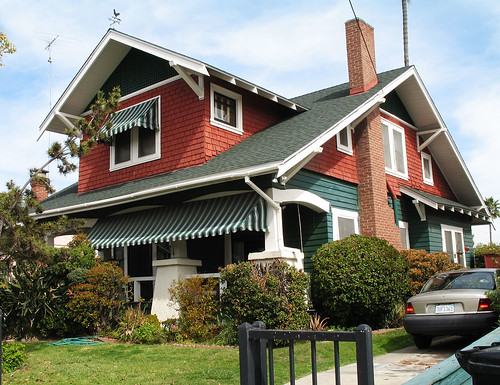
Craftsman style homes took off in popularity in the late 19th century following the founding of the Arts and Crafts movement in England in the mid 1800's. It's architecture encompasses the Bungalow, Foursquare and Craftsman types of architecture.
It remained very popular until the late 1930's. Many types of pre-made kits were even available from companies such as Sears and Roebuck's that could be built on site.

Colors from this period of architecture took their cues from nature and tended to be very organic though it must be noted that they were often considerably brighter than the "muddy" colors of the Victorian era, especially in the later Craftsmen years. Advances in the paint industry also allowed for a much wider range of paint colors to choose from. Deep browns, yellows, greens, greys and reds dominated the first Craftsman homes often with complementary darker trims and details. In the 1920's and 1930's, lighter, brighter tones were popular and trim work was often lighter or even off-white. On two story Craftsman or Foursquare homes, color was frequently divided between the upper and lower levels. A darker color could either appear on the first or second story.

Many homeowners who are lucky enough to own one of these gems want to return their home to it's historical glory. Perhaps a paint job from a previous owner is historically wrong or simply just plain unappealing to it's new owners. Many paint companies now offer "historical" color palettes to help guide homeowners in the right direction. Hiring a knowledgeable color consultant is also money well spent when it comes to choosing historically correct colors that also appeal to the homeowner.

Saturday, November 8, 2008

November: Why is white the hardest "color" to choose in paint?


Whether it's choosing a trim color, a main wall color or exterior color, white can frustrate and confuse even those who consider themselves having a good eye for color. There are cool whites, warm whites, whites with a number of undertones such as green or blue and whites that shift in different lights or times of day. Often it is recommended to use cooler whites with cooler colors or more bright colors while applying warmer whites with warmer or more muted colors. In spaces with low natural light, white can often look gray or yellowish. But my biggest rule is that there is always room to break color rules when it is your space you are choosing colors for. Your preferrence and comfort with color should always prevail.

So what are some tried and true whites that designers and color experts often turn to? Many color consultants prefer a slightly warmer white without veering off into the cream palates. Benjamin Moore's biggest selling paint color happens to be Linen White. Experts often swear by this color for almost any situation. It is a very warm white that tends to work well with other colors. Ivory White is also a favorite as well as Bavarian White. For cooler whites, Benjamin Moore's Montgomery White, Decorator White and Super White are popular for their crispness and trueness. Pratt and Lambert's Silver White is also hard to go wrong with as well as Behr's Moon White. Benjamin Moore's Atrium white is a well loved white but can have a blue undertone to it in some light. Acadia White from Benjamin Moore is a lovely white with a green cast to it.

Whether you are using white to bring out the wood accents in a room or to help tie the rooms in your home together with a white trim, give it a respectful amount of consideration and your other colors will thank you!


Image source: Blinds.ca.com
Photo by Tammy Manet

Monday, September 29, 2008

Welcome!

Welcome to my blog! I am an architectural color consultant in Oakland, California. I have combined my love of color and architecture along with my background in interior design into my business. I will present monthly posts relevent to the use of color in architectural spaces.