
Here in the East Bay, we've been blessed with the arrival of so many wonderful, affordable home furnishing stores. A couple of my favorite stores just opened this last year taking away the need to go into San Francisco or through the tunnel to Walnut Creek to browse. I was particularly excited when West Elm and CB2 opened this year. Hard to believe when I moved to Oakland from San Jose in 2000, about all you could find was the recently opened IKEA in Emeryville. Among the well priced modern lines available to us East Bay folks, we have an embarrassment of wealth to choose from, Z Gallerie, Crate and Barrel outlet, Design within Reach (which is still out of my reach), CB2, EQ3, IKEA, West Elm, Pottery Barn, Anthropology and Restoration Hardware.
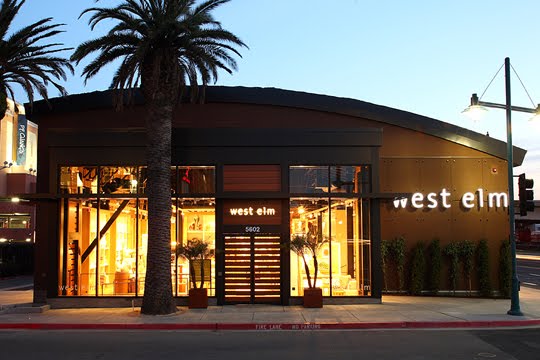
Last week I was lucky enough to attend a To The Trade event at West Elm with Benjamin Moore-thanks to my lovely colleague Kelly Berg for the invite. The store was closed to the public for a few hours while we were treated to an amazing presentation by Benjamin Moore color and design specialist, Mary Hoffman.(Sorry for the not so great IPhone photos!)

She talked about Benjamin Moore's trend predictions for 2010-2011 which have been in the works since 2008. Color trending is such a hot topic. While I always stress picking out the best possible colors for a clients unique situation, style and tastes in terms of long term satisfaction, it is fun to see where color is taking us. As many of us knew, blue is set to make a comeback! Purple continues to be very popular and expect to see it paired with more blues.

Trending attempts to take the pulse on how society is collectively feeling and forecasts that into directions that color will move towards as a response. Frankly, it's not rocket science to realize that folks are reeling from economic upheaval. People are spending more time at home and want it to be their sanctuary. Mary emphasized 3 trends in what people are seeking:
Simple Indulgences; Simple Indulgences takes a new tact on creating authenticity in our homes and a new, lush way of treating ourselves. Attainable luxury through color, texture, pattern and material.
Fresh Perspective; Fresh Perspective speaks to the root and essence of New Beginnings. Honest materials, human handwork and eco-inspired themes such as carbon footprint and eco-currency influence the color scheme. Colors are grounded and represent the earth’s rich strata of neutrals.
Alternative view; Alternative View connects with our creative side and sparks the authentic part of ourselves that wants to break out and be more expressive. Passionate and animated, this is the new escapism. We want to inject humor into our lives by having fun and getting creative with color and design. Quirky, fun and outgoing. A yellow undertone prevails within all colors.


The hot trend of yellow/gray will start to sneak some pinks into the mix towards 2011, Mary predicts. The big love of greens continues, although don't be surprised if you see a trend move more towards the bluer based greens instead of the yellow based greens. Did you know that Cedar Green(2034-40) is Benjamin Moore's color of the year?
 Around the store we noticed that Mary had placed many large paint boards next to the lovely West Elm Vignettes. Much of the West Elm palate is currently quite neutral and she wanted to show the designers how pops of current color can be integrated into this palate.


She also had on hand an array of paint chips that reflected these current trends.

I chatted with one of Benjamin Moore's marketing men, who informed me that their relationship with the family of Pottery Barn/West Elm/Williams and Sonoma is indeed continuing into the foreseeable future. Last but not least, how happy was I to see these sweet little ferns all over the store! Nice to see I can do a little trend predicting of my own.


