
 My colleague and fellow IACC-NA (International Association of Color Consultants, North American) member, Belinda Hallmark, had what I consider an ultra cool project this last year; specifying colors for the repainting of the rainbows on the Waldo Tunnel on the south side of the Golden Gate Bridge! Belinda is a color and finishes consultant in Novato and has worked on many large scale projects. When I first heard her mention this project, we were attending IACC seminars in San Diego together. I spent every moment I could talking with her on how she approached such an unusual large scale project.
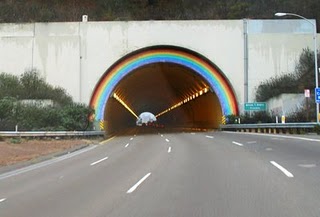
These tunnels connect Marin County with access to the Golden Gate Bridge into San Francisco. The tunnels existed sans rainbows for many decades until they came under the whims of one person. The rainbows went up in 1970 after Alan S. Hart, former director of the San Francisco District of Caltrans, then known as the state Division of Highways, ordered it. He was retiring and made a last-minute decision to have the portal arches to be painted in a rainbow without his bosses approval. Although this initially caused huge outrage in Sacramento with those in charge, it quickly quieted down when the public embraced the new added colors. The tunnel was featured in at least two big films, Dirty Harry and Dark Passage with Humphrey Bogart(pre-rainbow).
 In 1981, there was a movement and some money was raised to use mosaic tiles to replace the paint, but that never came to be. Time, weather and traffic pollution gradually took their toll on the paint and the landmark rainbows were looking faded and sad. Some local residents started asking CalTrans if they could raise money to repaint it but CalTrans fianlly stepped in to restore the colorful tunnels. But it turned out they were in need of some color consultation! The following is an interview with my colleague, Belinda, regarding her approach to restoring this iconic landmark.
Belinda:
I was reading the Sunday Marin Independent Journal, having coffee with my husband. The cover story was on the history of the waldo tunnel and how Caltrans was considering repainting the rainbows after years of wear and tear. I read the article and said to my husband, "Do you know how many times I'll read an article about something that I could get involved in and say to myself, wow that would be fun!" I got up and said, "You know what, I'm not going to talk about it, I'm going to see if I can make this happen!"
I sent an email to the person who wrote the article, another to Cal Trans and left a message with Cal Trans on the phone. I never expected to hear back from them, but to my surprise, Cal Trans called me within a few days. However, they called to tell me that they went to their archives and found out what kind of paint was previously used and they were in the process of selecting their colors. I asked them if they had the color names or numbers for the original colors and that information was nowhere to be found. I offered to help them select their new colors by donating my architectural color consulting services and that I think I could even find a way to donate the paint, and that the brand and quality would be far superior to what was previously used.
I live in Marin County and do a tremendous amount of work in Marin County. I saw this as a perfect opportunity for me to give back to my community. They agreed to meet with me a few days later where I was able to share my vision for the color direction and what I could offer them in terms of my professional services and the best paint for this project.

Marie: Did they have a specific way they wanted you to approach specifying the colors or were they open to your method of working with color?
Belinda:
This region of Cal Trans is responsible for the highways, tunnels and bridges for most of Northern California. All of the paint colors have already been predetermined, ie; the Golden Gate Bride. They never had to select new colors or design a palette that worked together. They were completely open and very appreciative. They had no idea what went into selecting colors.

Marin Independent Journal
Belinda:
Cal Trans was so great and patient with me! They painted up every color I asked for and we tried several different ranges. They even painted on the walls of their cement office building first to get an idea of what they might look like. They also played with airbrushing the stripes to feather them out for a softer effect. In the end, we all preferred hardlining the colors, as it felt so much cleaner. The hard lines also made the colors pop more.
 ABC7 Photo
Belinda:
With the bay on one side of the tunnel and the Pacific ocean on the other, the weather conditions can be quite extreme. I went up to the tunnel at least two to three times each time the samples were painted. I had to see them in the morning when the fog was still hanging over the tunnel with mist and sometimes rain, and in the middle of the day when the sun would shine directly onto the rainbow, then again at the end of the day when the shadows would appear before the fog returned again. The colors would change dramatically under the various conditions. In the end, the palette that really worked was the one that looked great under all conditions. I would also go up there on the weekends so I could watch Cal Trans paint. I was also constantly getting feedback about how Benjamin Moore's Aura paint was working.
 MoreMarin.com
Belinda:
The most challenging aspect of this job was the monumental responsibility I felt to make everyone happy. The local people have such a connection to these rainbows, it's a historic landmark. I didn't want to let anyone down. And, especially during these challenging times, it was really important to me that each and every time you looked at the rainbows, it would lift your spirits and make you smile.


