header photo

Tuesday, April 13, 2010

Playful Color and Design in Hotels


During spring break, I had the pleasure of staying at a very hip, newly remodeled hotel in Santa Cruz on the Northern California Coast. A couple of friends had forwarded me their link over the past year...... so the kids, some friends and I finally decided to check out whether this place was a cool as it looked on their website. Those of us in the color/design biz can be pretty fussy about our lodging and wary of slick websites using creative photography.......only to be disappointed when we see the site in person. In today's climate of precious little vacation/out of town time, it's frustrating to see an expensive hotel miss the mark on color and design. When I find an exceptional hotel, I really have to give it a shout out. This hotel has been here for about 40 years but I understand it was a certified dump prior to it's renovation. It's got a unique location in being actually ON the beach, near Santa Cruz pier and just down from the fabulous, historical Santa Cruz Boardwalk.

It was interesting to dig up some history on this little gem. Originally called the Dream Inn, it then became the Coast Hotel. It's now back to it's original name. The hotel created a stir back in the early 60's when it was built into the side of a beach cliff. Outcry banned all further building of this scale and location in the city.

1963-Front of the Dream Inn; Are they running from the bad architecture?

The Dream Inn Today

We reserved one of the suites and within seconds of walking in the lobby I was impressed with the use of bold but well placed playful color.
Lobby-Dream Inn

Huge, colorful rocking chairs in the lobby let you know you're here to have fun! The rooms incorporated colorful splashes of whimsy in using oversize bean bags, light up seats and rock album cover art for the walls. I love that the splashes of citrus throughout the suite were balanced with the appropriate neutrals and some interesting textures.

The overall look was kind of a hip Palm Springs feel. The new parent company, Joie de Vivre, reportedly uses a form of “brandscaping” exercises to help set the theme and design goals for their properties. Among other things, they chose two consumer magazines to represent their theme. In this case, they chose the now defunct Domino magazine as well as Surfer magazine. So many interesting hotels around the world are coming out with some very far out candy hued designs. They understand that some of us want a more modern, colorful version of the traditional hotel. What is YOUR hotel style? What makes hotel color design over the top vs. balanced for you?
Dream Inn

More Colorful Hotels:

BelleChasse Hotel, Paris, France
Hi-Hotel-Lounge, Nice, France


Hotel Missoni, Scottland
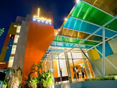
Dara Hotel, Thailand
25 Hours Hotel, Frankfurt, Germany
Vanguard Hotel, Chicago
Hotel Colorful Days, China
Exterior, Colorful Days in China
Color Hotel, Paris, France

Wednesday, March 31, 2010

West Elm / Benjamin Moore Event


Here in the East Bay, we've been blessed with the arrival of so many wonderful, affordable home furnishing stores. A couple of my favorite stores just opened this last year taking away the need to go into San Francisco or through the tunnel to Walnut Creek to browse. I was particularly excited when West Elm and CB2 opened this year. Hard to believe when I moved to Oakland from San Jose in 2000, about all you could find was the recently opened IKEA in Emeryville. Among the well priced modern lines available to us East Bay folks, we have an embarrassment of wealth to choose from, Z Gallerie, Crate and Barrel outlet, Design within Reach (which is still out of my reach), CB2, EQ3, IKEA, West Elm, Pottery Barn, Anthropology and Restoration Hardware.

Last week I was lucky enough to attend a To The Trade event at West Elm with Benjamin Moore-thanks to my lovely colleague Kelly Berg for the invite. The store was closed to the public for a few hours while we were treated to an amazing presentation by Benjamin Moore color and design specialist, Mary Hoffman.(Sorry for the not so great IPhone photos!)

She talked about Benjamin Moore's trend predictions for 2010-2011 which have been in the works since 2008. Color trending is such a hot topic. While I always stress picking out the best possible colors for a clients unique situation, style and tastes in terms of long term satisfaction, it is fun to see where color is taking us. As many of us knew, blue is set to make a comeback! Purple continues to be very popular and expect to see it paired with more blues.

Trending attempts to take the pulse on how society is collectively feeling and forecasts that into directions that color will move towards as a response. Frankly, it's not rocket science to realize that folks are reeling from economic upheaval. People are spending more time at home and want it to be their sanctuary. Mary emphasized 3 trends in what people are seeking:
Simple Indulgences; Simple Indulgences takes a new tact on creating authenticity in our homes and a new, lush way of treating ourselves. Attainable luxury through color, texture, pattern and material.
Fresh Perspective; Fresh Perspective speaks to the root and essence of New Beginnings. Honest materials, human handwork and eco-inspired themes such as carbon footprint and eco-currency influence the color scheme. Colors are grounded and represent the earth’s rich strata of neutrals.
Alternative view; Alternative View connects with our creative side and sparks the authentic part of ourselves that wants to break out and be more expressive. Passionate and animated, this is the new escapism. We want to inject humor into our lives by having fun and getting creative with color and design. Quirky, fun and outgoing. A yellow undertone prevails within all colors.


The hot trend of yellow/gray will start to sneak some pinks into the mix towards 2011, Mary predicts. The big love of greens continues, although don't be surprised if you see a trend move more towards the bluer based greens instead of the yellow based greens. Did you know that Cedar Green(2034-40) is Benjamin Moore's color of the year?
Around the store we noticed that Mary had placed many large paint boards next to the lovely West Elm Vignettes. Much of the West Elm palate is currently quite neutral and she wanted to show the designers how pops of current color can be integrated into this palate.


She also had on hand an array of paint chips that reflected these current trends.

I chatted with one of Benjamin Moore's marketing men, who informed me that their relationship with the family of Pottery Barn/West Elm/Williams and Sonoma is indeed continuing into the foreseeable future. Last but not least, how happy was I to see these sweet little ferns all over the store! Nice to see I can do a little trend predicting of my own.

Thursday, March 18, 2010

Very Colorful Film Test From 1966

While I am waiting to complete an interview with a colleague for this blog, I thought I would share a fascinating 16mm color test filmed in 1966. My thanks to Mary Cosola who found this gem on YouTube. They apparently used the footage to calibrate the color in film. The person who posted this video explains that this was Kodak print stock from the 1960's and that this film held it's intensely saturated color over time, unlike the films they switched to in the 1970's. There is no sound which gives the video a further strangeness as you watch the actors stand and smile in different indoor/outdoor lighting situations. I would love to know more about these tests and how they set up these video segments. The interiors are fascinating while some of the actors look like they're waiting uncomfortably for their lines! I'm kind of loving those shiny yellow kitchen cabinets towards the end! Click on the link below:


Monday, February 22, 2010

Houseplants-A Forgotten Design Element?

It's ironic that despite the movement in green design, plants are often absent in much of the interiors I've been seeing in shelter magazines lately. Plants can help purify the air and bring a wonderful design element into a room, but sadly, they are often absent, ignored or an afterthought in the design process. Plants can soften the edges of a room and bring in a much needed color and textural element. I'm really loving the idea of citrus, succulent, bonsai, palms and dish gardens-revisited and restyled to be current and fresh. I recently found myself guilty of overlooking this important design element in my own living room. In fact, I think "overlooked" is a bit of an understatement. Let's face it, life is busy, and I rarely have time to play around with accessories in this room, but I've been making more of an attempt lately to update. It suddenly dawned on me one day that my two - 12 year old scraggly, sad ficus trees stationed on either side of my fireplace, having witnessed so much family life, were fighting with the rest of the room and overtaking it. (This pic circa 2005-guitar hero playing relatives keeping the trees company)In the middle of slowly adding some mid-century touches and color to my otherwise Deco-ish room, the ficus trees and their thinning branches seemed to be shouting “hello 1990's”.......as they had since, well, the 1990's. Overwhelmed by the thought of uprooting them and finding a new, loving owner (I couldn't bare to toss them in the gardening bin) they continued to dominate the room for a time. They were survivors in our move from San Jose to Oakland after all. I finally decided to replace them with ferns. I don't know where this idea came from but it was also accompanied by a fear of 1970's ferns...... and having lived through that decade, I was determined to avoid that! Retro touches are great but some things (like macrame) are meant to stay in the past.

Along with Ficus trees, ferns are especially wonderful at air purification and even help remove harmful chemicals such as paint VOC's from the room environment.
Searching far and wide around the local stores, I ran into a few large ferns that I deemed too“70's” The lacy ferns that fit the bill with their delicate, rounder leaves.....were not tall enough for the 18 inch pots I wanted to keep. I finally found some larger ones at a gardening center in Walnut Creek and bought their entire stock of 6 Adiantum ferns. The ignored ficus's found a loving new owner on Craigslist and hopefully my new ferns have the room pointed in the right direction......forward!

Other inspiring ideas for plants:

Love this!
I would like to see this idea using kumquat trees as well!
Photo Source

Even a great new pot can revive the look of a plant
Photo Source

An inspired cactus garden:
Succulent Garden ideas courtesy of Apartment Therapy
Jean-Marie Massaud Missed Tree Flower Pot-This unique vase is nearly 4 feet tall!
From the Houston Garden Show: Mini biospheres in a container garden


Friday, February 12, 2010

Architectural Chocolate


In the spirit of Valentines Day, I'd like to pay homage to one of my favorite colors-chocolate brown! I'm a bit of a foodie and architectural chocoholic. Two of my projects in 2009 involved the use of deep browns and I couldn't have had more fun with them. Chocolate brown conveys elegance, warmth and urban chic in a prominent way. It's growing popularity the last few years is noticeable although I have to say I've rather tired of much of the brown/baby blue combos I once enjoyed in design and graphics. Some of my clients have wanted this color as an alternative to highly saturated colors that they felt might be a bit too high profile to live with. When you think of the variables that chocolates come in, such a milk, bittersweet and deep dark, consider that dark brown paints also come in a wide range of choices. Some have red, golden, purple or grayish undertones that must be considered.
These clients were remodeling their Oakland Hills great room and like so many houses in this area, the old floor plan and flow was funky. Former owners added more strange touches. On it's way out was the boxy, small kitchen separating it from the rest of the large room as well as the curious white bathroom tile around the otherwise awesome freestanding fireplace. Also going was the reddish-coral accent wall that my clients had grown tired of.

They still wanted an accent color but not one that would hit them over the head! To compliment the deep subtle greens and warm grays in her amazing new granite we explored the possibility of brown. New cabinets were added as well. The client's husband initially balked at the deep brown but finally came around to our views and now LOVES the balance and hint of drama it gives to the completed room. We used Benjamin Moore's Rural Earth on the formerly red accent wall.

Another client called me after she and her husband were worn down after numerous stabs at testing paint colors on the exterior of their lovely Oakland home. They were torn between repainting the exterior deep green once again but were also exploring the possibility of deep browns. They had reservations on whether it would be appropriate or overwhelming to use such a deep brown. After looking at large brushouts and rendings they settled on Benjamin Moore's Appalachian Brown and it's subtle purplish undertones. They were thrilled with the deep rich brown and the home's transformation. Another fan of deep brown was born. This home no longer fades into the background but makes an elegant addition to their neighborhood.


Here are some additional inspiring uses for browns:

Pottery Barn


Let me know-what are YOUR favorite deep browns to work with?
Happy Valentine's Day! Hope your day includes plenty of chocolate!