header photo

Friday, July 30, 2010

Color for Colorphobes and the Commitment Shy

Quite often, I run into a situation where I'm playing referee/marriage counselor and sometimes even parent/child counselor in the arena of color. Everyone has different tolerance and comfort levels for color and this comes to a head when it's time to paint. Strong opinions about color usually arise when one client feels the need for some fun, punched up color, whereas the other partner or family member feels uneasy outside of comforting neutrals.

I hate to draw predictable, clean lines down the sexes and single out the guys for color fear ( I've certainly experienced male clients who push for more adventurous color at the consternation of their partners!) but this is quite often the case, (sorry guys!) I for one, am married to a man who loves vivid, bright, might I even say, loud colors-so I know you're out there, men!


My job as a colorist is to bridge the desires of both and find solutions that they not only can live with, but love. Sometimes, choices can be ruled out based on furnishings, finishes or other elements in the room. Other times, compromises can be made in other ways. The first rooms I turn to for areas of adventurous color are the smaller, less used rooms in a home such as the laundry room (if you're lucky enough to have one!) and powder rooms or guest bathrooms. Tiffany Blue is a fun color I've seen and had requests for in laundry rooms.


Cottage living

Not only are these out the flow with the rest of the home, they are seldom occupied for long periods for time. Also, they don't require a great deal of paint and can easily be repainted if one tires of the color.


Some people are intrigued with the idea of color but have commitment issues when it comes to painting an entire room in an adventurous color. This is when a pop of color in a closet, cabinet or even a drawer may satisfy that need.


Apartment Therapy

Wow! A great way to embrace a little red!
I could see this in my dining room built in cabinets.


Domino

Martha Stewart

Color can fit in anywhere. Even a tiny medicine cabinet!
Also a great way to use wallpaper or contact paper.


Design Sponge

I love the concept of recapturing space in a home and using in new ways. A burst of color personalizes it.
Closet office anyone?


Country Living

What creative ways have you used to introduce color or use it in harmony with a color phobe in your home?

If you need a color referee or simply some color consulting done for your home or businesses - interior or exterior, please contact me: Marie@ColorMarie.com


Saturday, July 17, 2010

Guest Post for Hue Consulting-Car Color Trends


I was thrilled to write a guest post for my lovely colleague, Rachel Perls, who is enjoying her maternity leave. She has a fantastic blog, Hue, which enjoys a large following of devoted fans, including me! Since I have two car crazy boys, I thought it would be fun to explore the world of car color trends.


Hope you'll swing over and visit:
HUE

Saturday, July 3, 2010

Summer Design and Mantelscapes


Welcome to Summer 2010!
What fabulous plans do
YOU have?
Do you like to seasonally change things up in your home or bring out accessories to reflect summer? I have a large stash of seashells, old coral and other items collected on travels over the years. Careful editing means not all of them are hauled out of the basement anymore. Some end up on the dining room shelves and in apothecary jars around the house. I had fun putting together the mantel this year with a mix of blues, coral, starfish, shells and modern graphics.
Photo by me!

Did you know these are often referred to as "mantelscapes"? Definition: Mantelscapes are a unique blend of decorative accessories tastefully arranged on ones mantel, also known as mantel decor. I guess this is the cousin to the design term "tablescapes"? Kind of a silly word but I'll go with it.... Whatever your designs are for the summer, make every second count. Don't forget to go outside often and enjoy the actual landscapes awaiting you!


Here are some more inspiring summer mantels:
Look at this amazing DIY project from Georgia Peachez Blog! What a great idea for a beach house where it's seashells all years round:
Housedressing Company

Scale, color, variety and not too symmetrical groupings are key for getting that casual summer look
Jenny Sisney

Summer can also be more urban and understated
Kara Butterfield

......or whimsical and thrifty!

Apartment Therapy

Inspace

The summer season inspires more whimsical, carefree decorating. A great time to hit the thrift stores and garage sales! What are your favorite decorative items for the summer?

Sunday, June 20, 2010

Color Study Changes Devo's Iconic Hat

One of my favorite bands from back in the day, Devo, has finally put out a new album after 20 years. Never what you'd call a traditional band, Devo decided to employ focus groups and color studies to make many of the decisions for them. The album is aptly titled, "Something for Everybody". The biggest outcome was a change to their iconic red hats which have now changed to blue. Frontman, Mike Mothersbaugh, had this to say on the color study:


We've employed focus groups to help us choose a color. There are advantages and disadvantages we've found. We've gotten letters from people that said that they had problems with red hats. The color red, they felt, was unsafe. So the energy dome, I'm pretty certain it's going to change color.


The color study not only gives you your Devo color but asks such thought provoking questions as “Which color for the car makes you dislike this man more?” or "If you were a color, you'd mix yourself with which of the following colors?” You are sometimes given a choice of 6 colors and your choice is pasted into the picture.

Fans and the public also decided which tracks made it onto the album and gave costume decisions as well. On the idea of using focus groups, Mothersbaugh comments:


We always felt that we never got used to our full extent. We had ideas about TV programming before there was an MTV. We were creating products in that medium six or seven years before that, but we weren't marketing students, we sounded like crazy artists.

In the last four years, I've worked on films and I've watched focus groups and sat in on them. They've made decisions that made me change music, even if I didn't agree with it. But they allowed the directors and producers, who were hyper-focused on certain problems and couldn't see the bigger picture, to have a fresh view.

Warners allowed us to choose Mother to do the marketing, which was great, because record companies can have 200 bands and if half a dozen are successful, they high-five each other at the end of the year. Ad agencies, they have a few clients at a time and they can't let any of them not be a success.

It was a fun idea, poking fun, and it eliminated any arguments within the band, because we could all put up our choices for things like the album title and put them to a focus group. We let the public choose the title.


Take the Devo color study yourself if you need a few minutes of entertainment:


On the Colbert Report last week, Stephan Colbert donned one of their new hats and commented that he felt the new outfits had a certain Kim Jung Il look! But as always, what I love about Devo, whether band members are working on their own unique projects or working together, is they are still managing to evolve and keep us entertained after 30 years.


Tuesday, May 18, 2010

Art Deco Heaven at the Paramount Theater

Are you an Art Deco junkie like I am? If you're living or visiting the San Francisco Bay Area, you're never far from a Deco fix! My favorites are the movie theaters. In fact, if I can, I try to stay out of the multiplexes in favor of these gems. I'll give up state of the art sound for the architectural experience any day-even in a dark theater.

Photo from Library of Congress

I recently took a 2 hour tour of the Paramount Theater here in Oakland. Two hours may seem like a long tour, but for the obsessed, it means there is time to cover almost every detail AND time to pick the brain of the knowledgeable tour docents. (Sorry if some of my pictures don't do justice)

This was one of the last of the large Art Deco theaters to be built during the boom era of 1920's of Art Deco theater construction and one of the few on the West Coast from that era. It opened in 1931 to much fanfare before the Great Depression hit. Technically, the theater has some of the more streamlined elements of Art Moderne design with less emphasis on the conventional, geometrical design of pure Art Deco but it retains much of the floura/fauna popular with Deco. Architect Timothy Pflueger designed the Paramount as well as having a far reaching hand in much of the design in the Bay Area. He designed other nearby theaters such as the Fox Theater in Oakland and he even influenced the Bay Bridge design. His architecture also endures in some of the more fascinating buildings throughout San Francisco and surrounding cities. He wanted you to have the feeling of being in a redwood forest with waterfalls and stylized greenery when visiting the Paramount:

Going to the theater in the 1920's and 30's was a huge affair that often started out in the early days with a silent movie and Wurlitzer organ accompaniment. The Paramount also boasted a 16 piece orchestra!

Wurlitzer performance at the Oakland Paramount

Sometimes there was a vaudeville or acrobatic act, followed by Newsreel footage, a cartoon and finally a movie. The movie started to take over the live acts in time and sound came into the movies. After the 1930's, the great theater era slowly passed. TV became popular heading into the 1950's and the Paramount fell into disrepair. It closed in 1970. Others like its sister theaters, the Paramount and Fox Theaters of San Francisco, were simply demolished to make way for office space, condos and parking lots.
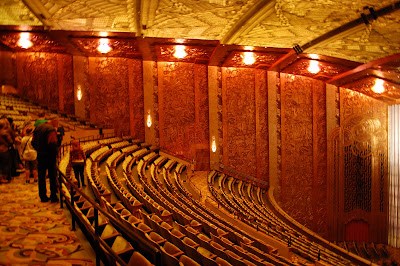
Theater Ceiling:

Painstaking work was done during it's restoration in the early 70's..... and again recently, to see that every detail was restored to it's original glory. My father tells me that he took me to see Willy Wonka and the Chocolate Factory at the Paramount not long after it re-opened in the early 1970's but I'm saddened that I was too young to have any memory of this!


I love Art Deco colors and enjoy the often unusual combinations. Art Deco colors usually are described as being rich and cool. Even the warmer earth tones are cooled and muted down. You often see navy blues, mustards, tans, black, gray, orange-reds, sea greens and lots of metal, etched frosted glass and mirror. The pastel colors you see in Miami and other areas are a regional variation and associated with tropical Art Deco. Pflueger brought in a wealth of skilled artisans to work on his buildings including Diego Rivera. Although Rivera did not work on the Paramount, it is thought that his work was the inspiration the much of the color palette seen throughout the theater.


The main woman's powder room with hand painted designs was one of my favorites:

Even the men's restrooms were given the grand treatment:

Floor detail of Men's Lobby:

A fascinating detail of Art Deco design is the ever present Egyptian accents. This was due to the obsession with Egypt in the 1920's after the discovery of King Tut's tomb.

New carpet was recently replaced using the original 1930 pattern. Its original copyrighted pattern had expired so they were able to use it.....unlike the slightly different version from the 1970's whose now defunct carpet manufacturer still holds the copyright.


This mural had to be painstakingly recreated due to extensive water damage. This was the women's smoking room. Women still did not often smoke in public in the 1930's so they escaped to this darkly lit room to light up!


My son's friend peeks through one of the fanciest portholes ever imagined to view the lobby level:

It's nothing short of breathtaking to walk into the lobby and into another world and era. Amid the sad tales of demolished or closed Deco gems, a success story was the recently remodeled and reopened Pflueger designed Alameda Theater (where I see most of my movies since the Paramount is mainly now a concert venue)......but more on that in a future Deco post! If you wish to tour the Paramount, you can on the first and third Saturdays each month.

Let me know if I can make your space come to life with color.....color to reflect your style!
510-381-3688 or ColorMarie.com

Monday, May 3, 2010

When Even Your Best Guess Requires a Do-Over!

It's a well known fact in the color community that we color professionals either experiment excessively with our own homes or ignore them until we can't bear to look at them anymore. I have until recently, fallen into the latter category. It's also a fact that even we can misjudge a color. When our family moved to Montclair Village almost a decade ago, I had the entire interior repainted. While I had some education in interior design, I was a stay-at-home mom at the time. I had not yet stumbled upon the incomparable training of the International Association of Color Consultants (IACC-NA) nor had I any interest in going back to work. I quickly picked out colors for each room and ended up without any major disasters despite the fact that I did not know how to test colors and was in a hurry-well, I was 7 months pregnant with a toddler under foot! It took awhile to find the perfect glossy red for my dining room but other than that, I was very motivated. I was eager to cover up a house of wall paper; wild jungle paper, flocked paper, wall paper with waterfall pictures and dingy, dingy paint everywhere else. At first the painter was dismayed and angry about all the colors I picked out and couldn't figure out why I wanted each room a distinct color. After he finished, he saw the end results of my strange choices and asked me to do color consulting for him! With baby number 2 on the way, I politely declined. Guess it must have planted a seed in my head for future days! The jungle wallpaper entry and hallway was painted a warm white at the time because it was my answer to flowing things in regard to the other rooms meeting up with it. I also thought it would make the heavy wood presence throughout the entry and hallway calm down a bit.
Fast forward nearly a decade. One son is now in middle school and the other is more than halfway through elementary school. I was about to host a school fundraiser recently and looked in dismay at my now blotchy, dirty white entry and hallway. Although people are frequently over to our home, this dinner set me on edge as many of these folks had not been in my house........ yet they know I'm a colorist-yikes, what poor advertising! I set about testing and imagining new colors. I settled on gold-green Henderson Buff (HC-15) from Benjamin Moore. I loved how it modernized the overwhelming oranegish oak paneling. I was also intrigued by Bainbridge Blue (749) and took a leap of faith on this deep blue for a bold accent. My trusty painter Carlos showed up and within a few hours my hallway was transformed! Carlos and I agree it looked lovely! Then as night falls, I am shocked as my hallway slowly turns bright greenish! This didn't show on my test boards. While I realized this color has a lot of green, I underestimated how that will amplify in a small, dark room where it will reflect off itself. Aha! I've heard of this happening but now I'm seeing it! Also, my husband mentions that he had changed out all the bulbs in that area of the house to compact fluorescent bulbs. So we are basically adding a layer of blue to the yellow which equals more green. Even my kids express surprise at the color shift!
While I distractedly attended my Photoshop class that night, my dear, patient husband went out and picked up a few different packages of incandescent bulbs. Don't get me wrong, we are quite environmental-but the compact bulbs will have to take up residence in other rooms for now. While the Henderson Buff definitely looked less green under new lighting, it still looks like a stronger color than I had anticipated, even the next day in natural light. I still love it, just not on ALL the walls. More testing and planning.....I decided to redo two walls in Revere Pewter to cut down on the strength (much grayer than pictured here).
Carlos patiently returned and finished applying the new paint within an hour. It immediately made a huge difference! I still get the strong colors I want without the intensity. I am reminded that picking and testing colors is taking an educated guess, no guarantees. Glad this guess ended up a win. Next to go is the taupe in the adjoining living room, stay tuned!