During spring break, I had the pleasure of staying at a very hip, newly remodeled hotel in Santa Cruz on the Northern California Coast. A couple of friends had forwarded me their link over the past year...... so the kids, some friends and I finally decided to check out whether this place was a cool as it looked on their website. Those of us in the color/design biz can be pretty fussy about our lodging and wary of slick websites using creative photography.......only to be disappointed when we see the site in person. In today's climate of precious little vacation/out of town time, it's frustrating to see an expensive hotel miss the mark on color and design. When I find an exceptional hotel, I really have to give it a shout out. This hotel has been here for about 40 years but I understand it was a certified dump prior to it's renovation. It's got a unique location in being actually ON the beach, near Santa Cruz pier and just down from the fabulous, historical Santa Cruz Boardwalk.

It was interesting to dig up some history on this little gem. Originally called the Dream Inn, it then became the Coast Hotel. It's now back to it's original name. The hotel created a stir back in the early 60's when it was built into the side of a beach cliff. Outcry banned all further building of this scale and location in the city.
1963-Front of the Dream Inn; Are they running from the bad architecture?

We reserved one of the suites and within seconds of walking in the lobby I was impressed with the use of bold but well placed playful color.
Lobby-Dream Inn

Huge, colorful rocking chairs in the lobby let you know you're here to have fun! The rooms incorporated colorful splashes of whimsy in using oversize bean bags, light up seats and rock album cover art for the walls. I love that the splashes of citrus throughout the suite were balanced with the appropriate neutrals and some interesting textures.

The overall look was kind of a hip Palm Springs feel. The new parent company, Joie de Vivre, reportedly uses a form of “brandscaping” exercises to help set the theme and design goals for their properties. Among other things, they chose two consumer magazines to represent their theme. In this case, they chose the now defunct Domino magazine as well as Surfer magazine. So many interesting hotels around the world are coming out with some very far out candy hued designs. They understand that some of us want a more modern, colorful version of the traditional hotel. What is YOUR hotel style? What makes hotel color design over the top vs. balanced for you?

More Colorful Hotels:
BelleChasse Hotel, Paris, France


7 comments:
Absolutely love the built in cocoon like seating in the Vanguard Hotel! I would've liked to see it with a darker floor though...
The Dream Inn's inside is so unexpected... so good to see fresh colors and not passé flowers on the walls...
Dream Inn looks like a fun place to stay :-) I'd take a colourful & whimsical hotel over a "boutique hotel" any day!!
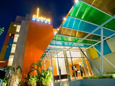
Love all the great colours on both the inside and the outside of the Dara Hotel.
Kelly
very cool! Reminds me of some of the hotels that have been re-purposed in downtown Portland, OR. Fabulous, Hip - all new again
Yes, I must say Portland is really hopping! I love the Pearl area. Must get back there soon to explore!
Lucky you - a few days in Santa Cruz on the beach?!? It does look like acute little place. And I absolutely LOVE seeing old photos of how a place "used to be." (Santa Cruz actually has quite an interesting architectural history!)
I think the remodel is fun. Loving the new colors - especially that yellow in the bath. Really cheery! Joie de Vivre is known for their hip, fun hotel designs. And the founder, Chip Conley, even wrote a book about his business philosophy called "Peak". If you go to his website, he says he named his company Joie de Vivre because he "was looking for joy in my own life." I love that these hotels share that joy. :)
This is a great post. Our hip hotels here on the East coast are usually so dark that you couldn't see color if they had any. What a pleasure to see all the brightness. Love your blog! Thanks for stopping by and leaving such a nice comment on mine. -- Jane F.
Thanks Jane! Well, this is an unusual hotel for this town. So many are rather dumpy. This place is a breath of fresh air!
Post a Comment