 Photo from Library of Congress
I recently took a 2 hour tour of the Paramount Theater here in Oakland. Two hours may seem like a long tour, but for the obsessed, it means there is time to cover almost every detail AND time to pick the brain of the knowledgeable tour docents. (Sorry if some of my pictures don't do justice)
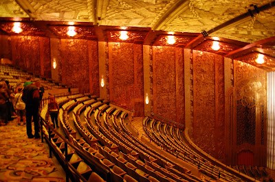
This was one of the last of the large Art Deco theaters to be built during the boom era of 1920's of Art Deco theater construction and one of the few on the West Coast from that era. It opened in 1931 to much fanfare before the Great Depression hit. Technically, the theater has some of the more streamlined elements of Art Moderne design with less emphasis on the conventional, geometrical design of pure Art Deco but it retains much of the floura/fauna popular with Deco. Architect Timothy Pflueger designed the Paramount as well as having a far reaching hand in much of the design in the Bay Area. He designed other nearby theaters such as the Fox Theater in Oakland and he even influenced the Bay Bridge design. His architecture also endures in some of the more fascinating buildings throughout San Francisco and surrounding cities. He wanted you to have the feeling of being in a redwood forest with waterfalls and stylized greenery when visiting the Paramount:
Going to the theater in the 1920's and 30's was a huge affair that often started out in the early days with a silent movie and Wurlitzer organ accompaniment. The Paramount also boasted a 16 piece orchestra!
Wurlitzer performance at the Oakland Paramount
Sometimes there was a vaudeville or acrobatic act, followed by Newsreel footage, a cartoon and finally a movie. The movie started to take over the live acts in time and sound came into the movies. After the 1930's, the great theater era slowly passed. TV became popular heading into the 1950's and the Paramount fell into disrepair. It closed in 1970. Others like its sister theaters, the Paramount and Fox Theaters of San Francisco, were simply demolished to make way for office space, condos and parking lots.

Theater Ceiling:
Painstaking work was done during it's restoration in the early 70's..... and again recently, to see that every detail was restored to it's original glory. My father tells me that he took me to see Willy Wonka and the Chocolate Factory at the Paramount not long after it re-opened in the early 1970's but I'm saddened that I was too young to have any memory of this!

I love Art Deco colors and enjoy the often unusual combinations. Art Deco colors usually are described as being rich and cool. Even the warmer earth tones are cooled and muted down. You often see navy blues, mustards, tans, black, gray, orange-reds, sea greens and lots of metal, etched frosted glass and mirror. The pastel colors you see in Miami and other areas are a regional variation and associated with tropical Art Deco. Pflueger brought in a wealth of skilled artisans to work on his buildings including
The main woman's powder room with hand painted designs was one of my favorites:

Even the men's restrooms were given the grand treatment:
Floor detail of Men's Lobby:

A fascinating detail of Art Deco design is the ever present Egyptian accents. This was due to the obsession with Egypt in the 1920's after the discovery of King Tut's tomb.

New carpet was recently replaced using the original 1930 pattern. Its original copyrighted pattern had expired so they were able to use it.....unlike the slightly different version from the 1970's whose now defunct carpet manufacturer still holds the copyright.

This mural had to be painstakingly recreated due to extensive water damage. This was the women's smoking room. Women still did not often smoke in public in the 1930's so they escaped to this darkly lit room to light up!

My son's friend peeks through one of the fanciest portholes ever imagined to view the lobby level:
 It's nothing short of breathtaking to walk into the lobby and into another world and era. Amid the sad tales of demolished or closed Deco gems, a success story was the recently remodeled and reopened Pflueger designed Alameda Theater (where I see most of my movies since the Paramount is mainly now a concert venue)......but more on that in a future Deco post! If you wish to tour the Paramount, you can on the first and third Saturdays each month.

510-381-3688 or ColorMarie.com


